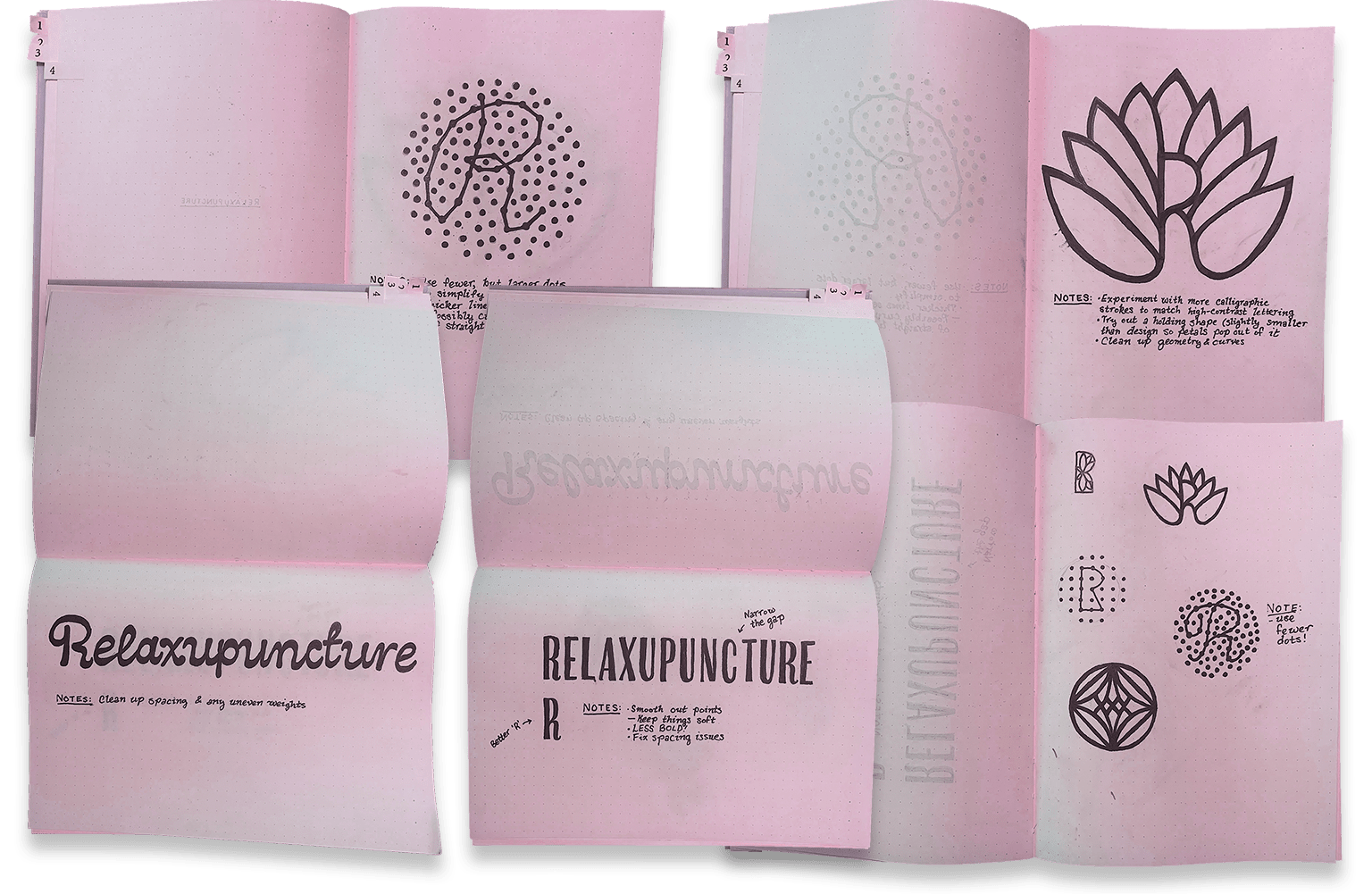
Round 1: Brain Dump Time
Every identity design project is different, but something they all share in common: they begin with a bunch of rough sketches. The goal at this early stage isn’t to impress with polished execution, but to generate many ideas as rapidly as possible—a brain dump—so I can quickly see what concepts show potential. I’m always surprised that some of the ideas that seem brilliant in my head look absolutely terrible in practice, and these quick sketches help me weed out those ideas before I waste too much time trying to execute on them.
Through conversations with the client, we came up with the strategy to visually position the brand similarly to a high-end resort spa, avoiding the clinical coldness or hippy granola vibes that dominate the competitive landscape. So, any solution should look luxurious and relaxing.
Two gives rise to three
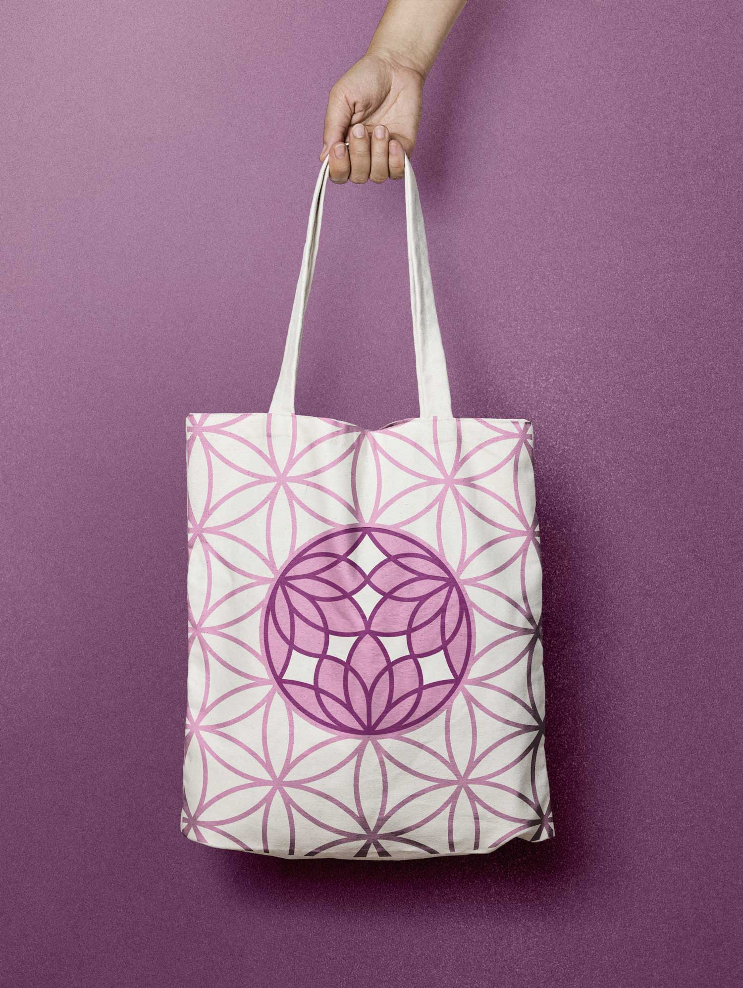
One of the early rough sketches from the brain dump round showed the most potential from the first round: a circular design featuring two abstract lotus blossoms mirrored vertically which resembled a diamond-cut gemstone. The biggest problem with it was the lotus blossoms didn’t make themselves obvious. Trying to get each lotus blossom to fit a half-circle made them lose their lotus blossom-ness. So I needed to find a solution to that problem.
In Chinese medicine, three is an important symbolic number. One symbolizes the unity and unknowable, which differentiates into two interdependent parts and processes—Yin and Yang. Three is something that comes out of the interplay between one (Yin) and two (Yang). Three is the result of a union, the mixing of the two. All things can be divided into three. Three is the number of what really exists, since there is never purely yin or purely yang, there must always be the three. The blended parts of Yin and Yang always exist.
I had been trying to divide the circular logo mark into two—which certainly makes for an easier-to-draw logo—when I should have been dividing the circle into three. Dividing it by three gave me a shape I could fill with a design where the lotus blossom retains it’s lotus blossom-ness.
It’s all so obvious in hindsight.
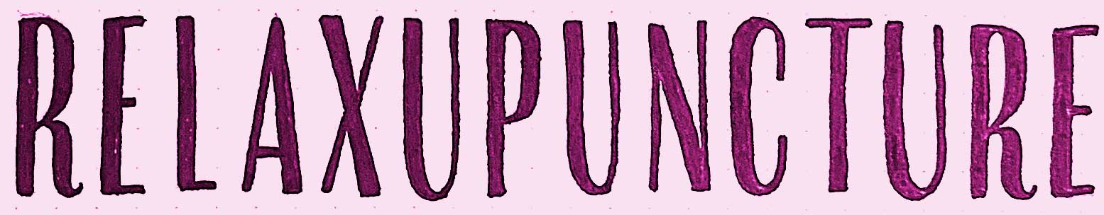
For the wordmark that accompanies the logo mark, narrow letterforms were important due to the length of the name. The wider the wordmark is, the fewer the applications it’ll fit. For the brand’s overall aesthetic, I wanted to subconsciously evoke the contrast between softness and sharpness, so I went with a lettering style with a high contrast between thicks and thins—which also helps with that luxurious resort spa aesthetic we were trying to achieve. When you see high-contrast lettering, you mentally associate it with brands like Vogue, Armani, and Hilton.
Round 2
Round two is all about executing on the chosen sketched concepts. Here’s a presentation I gave the client showing the evolution of six different versions of the logo mark.
The marks up for vote were versions 3, 5 and 6, with version 6 ultimately chosen.
Fleshing out the identity
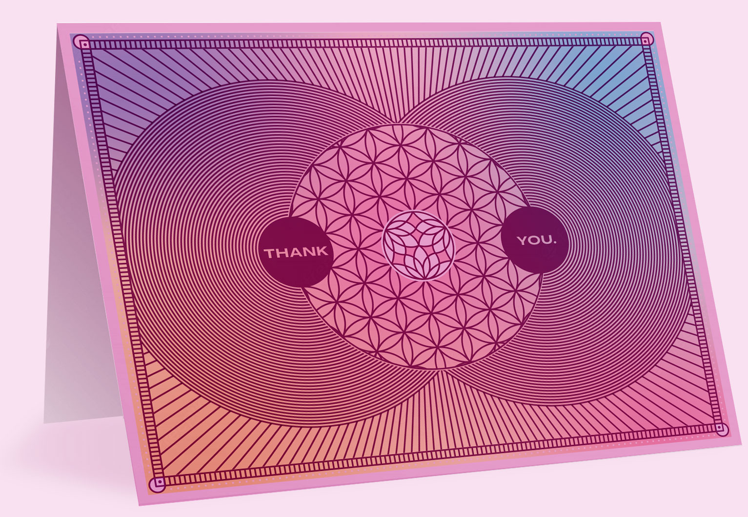
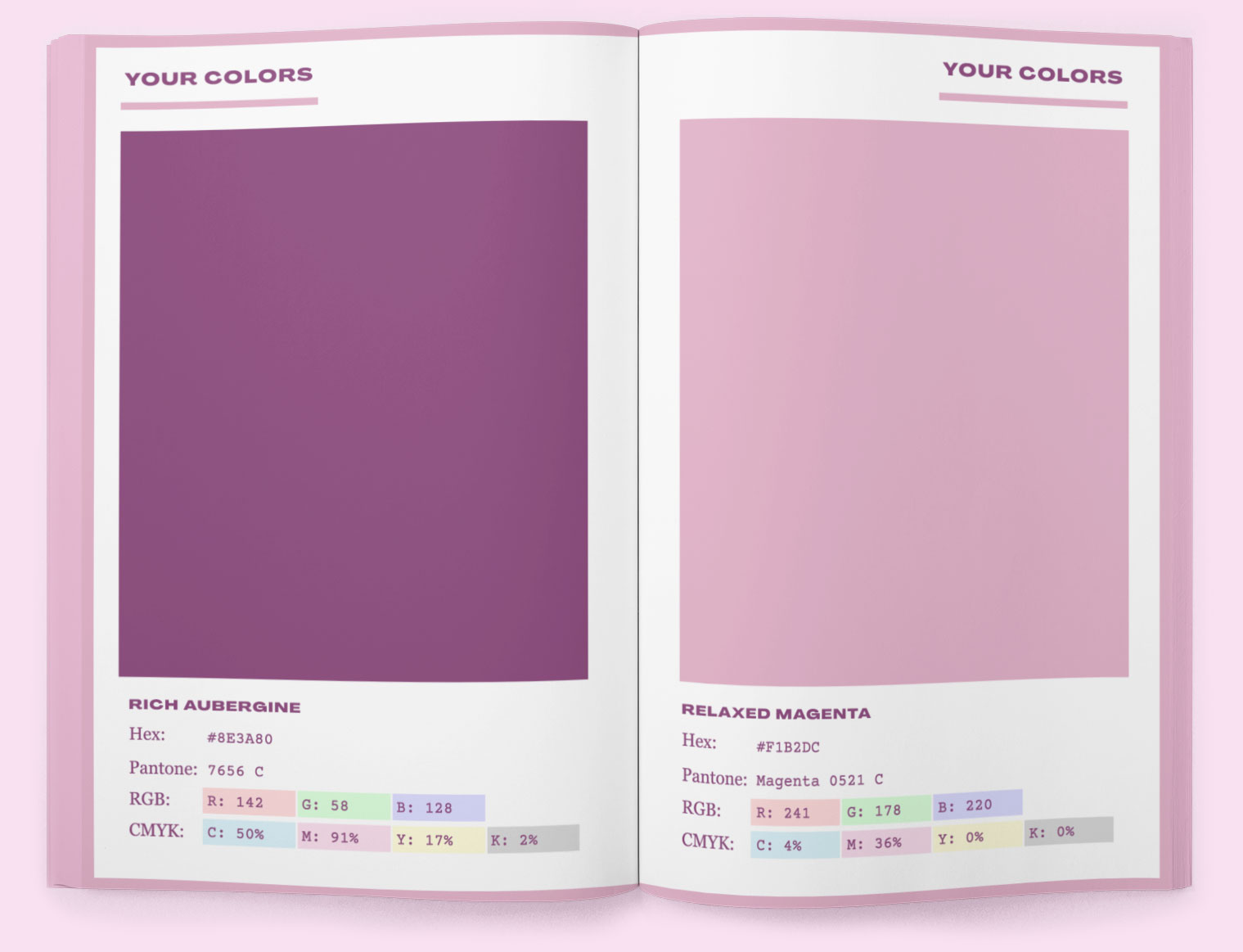
For the brand’s main colors, I chose a rich, deep purple—evoking luxury—paired with a soft, toned down magenta.
To help achieve the relaxing, resort feel of the identity (and represent the softness in the soft-sharp contrast), I decided early on that I wanted to incorporate amorphous gradients softly undulating in the background.
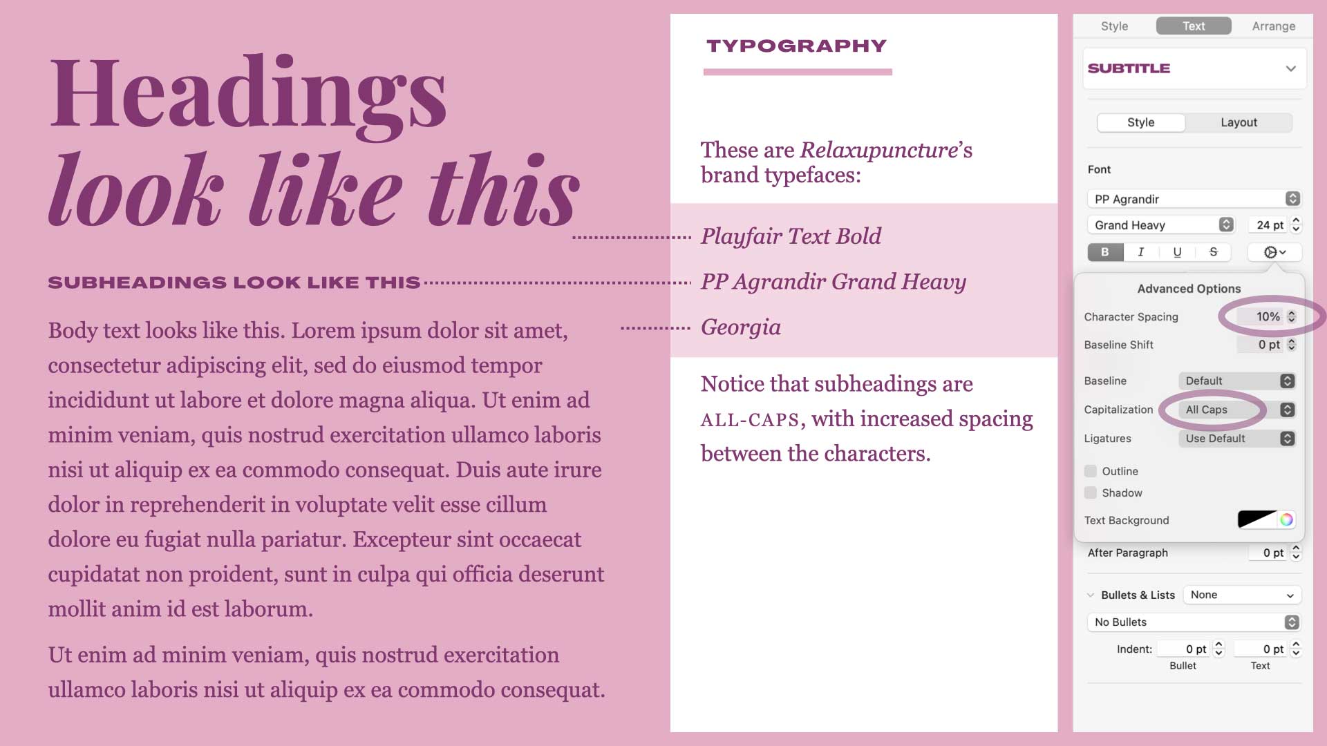
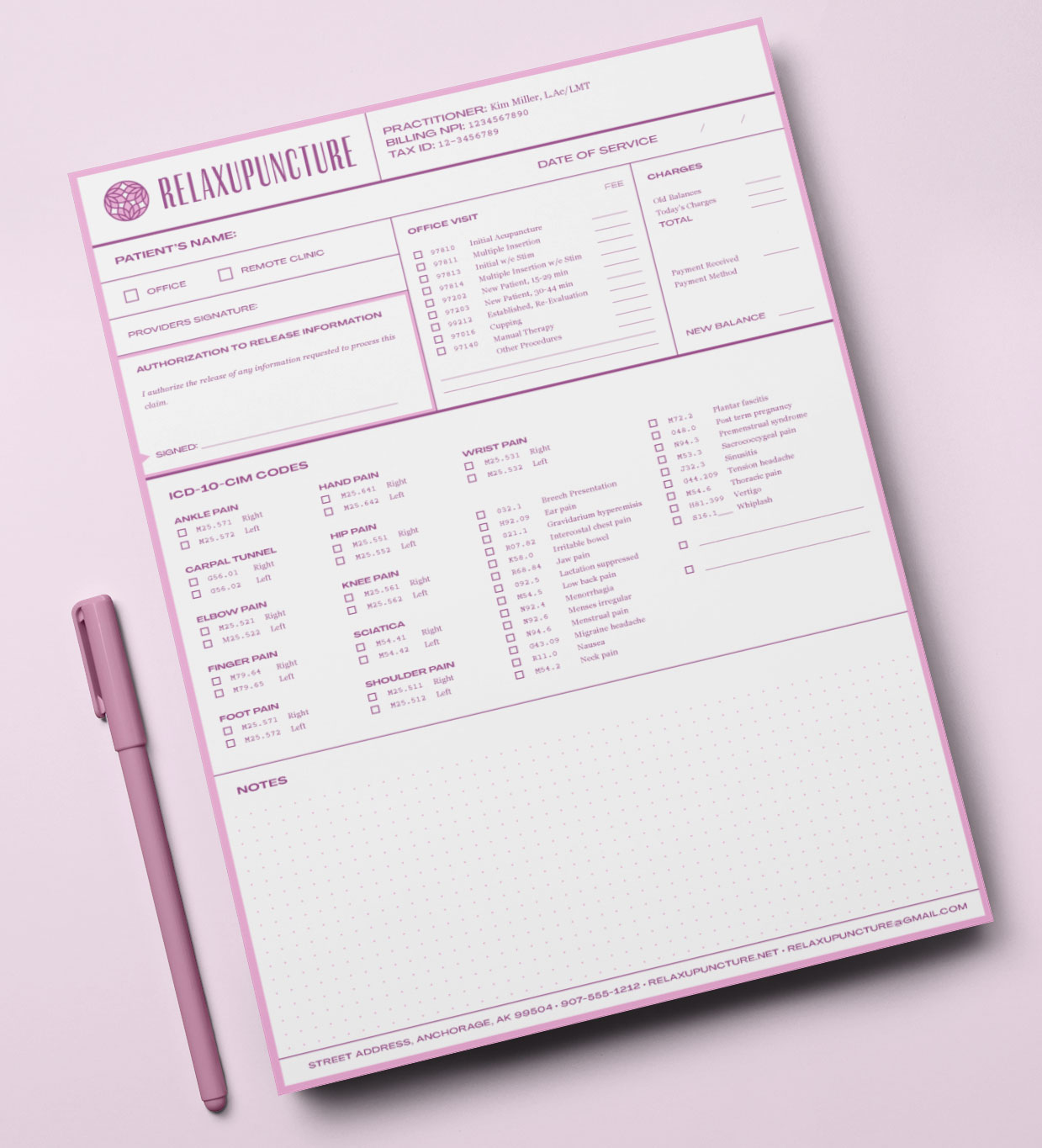
The typography we went with included a heading typeface with high-contrast thicks and thins to pair well with the wordmark, a wide, bold subheading typeface that contrasted the narrow letter forms of the wordmark, and a highly legible, bookishly serious serif typeface for body text.
Putting it all together
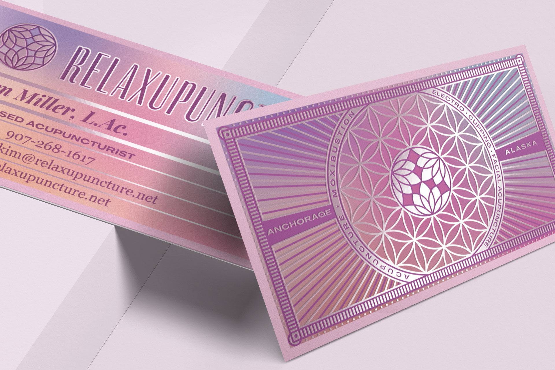
Relaxupuncture’s business cards were printed with a cold foil process, which means a design is stamped into the blank paper stock using silver foil at the beginning before the regular 4-color printing process happens. This results in pops of subtly pink-hued silver shining through the design.
Relaxupuncture’s Website
Relaxupuncture’s website is where the identity really comes to life. The logo mark animates on load. Gradients move in the background. Layered elements include soft, frosted transparency, blurring the backgrounds behind them. Interactions smoothly animate.
All hand-coded from scratch to make maximum impact while loading quickly.