 First, a bit of history. We started Rooty Poots as a soda shoppe in the Philippines, with a goal of crafting inventive sodas that tasted far better than the novelty the flavors sounded like. Sodas like The Vagabond, a vanilla-bergamot-darjeeling soda with cold-frothed almond milk floated at the top, or The Woody Harrelson, a ginger ale with a whiff of wood smoke.
But then plans changed, we moved to Alaska, and the goal then became to make the best coffee shop possible, combined with fun and inventive foods and great music.
Here’s a look at some of the stuff I’ve created for Rooty Poots.
The standard logo.
One of countless animated possibilities.
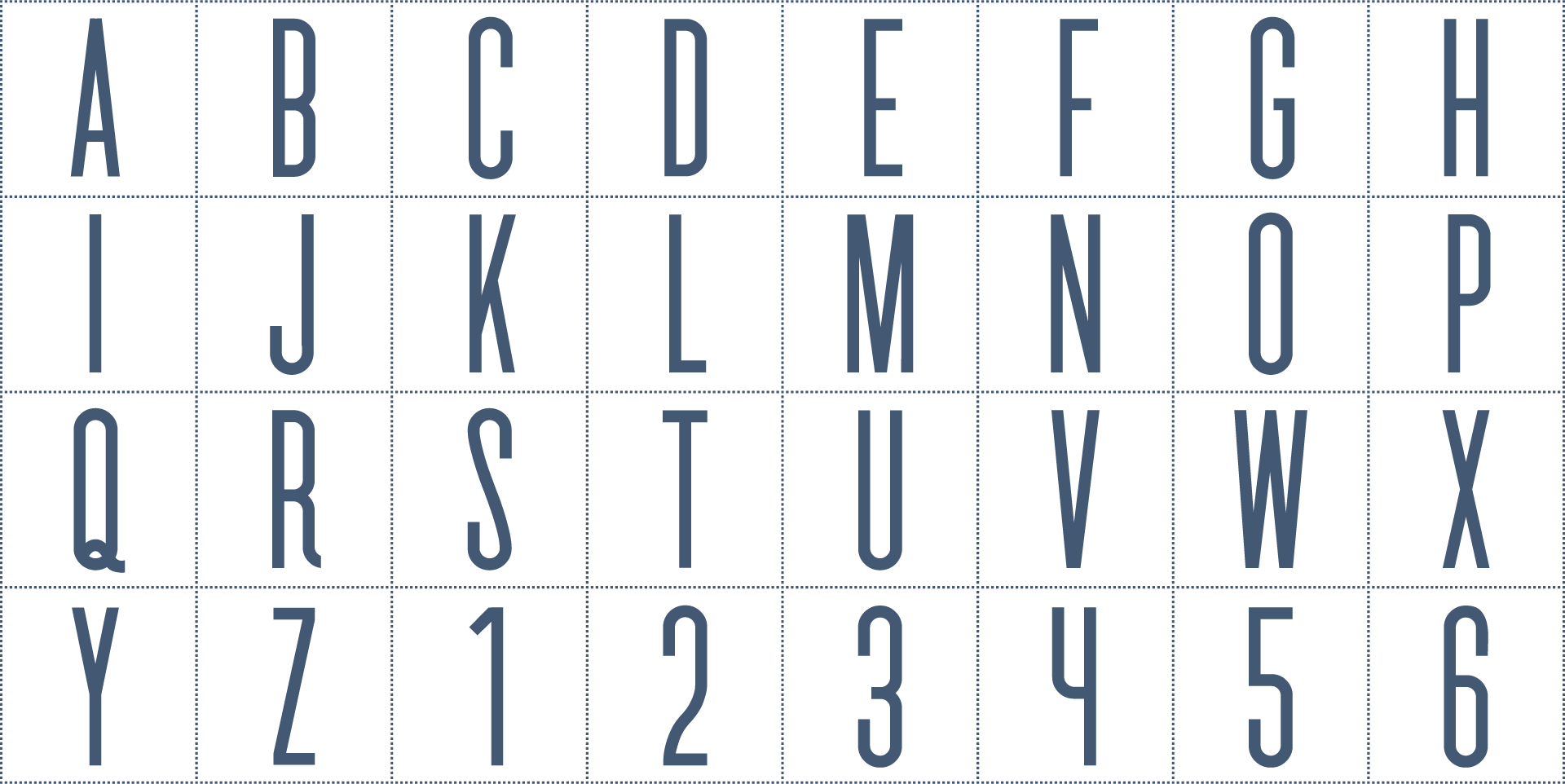
I made a custom font for headlines, called Rooty Poots Sans.
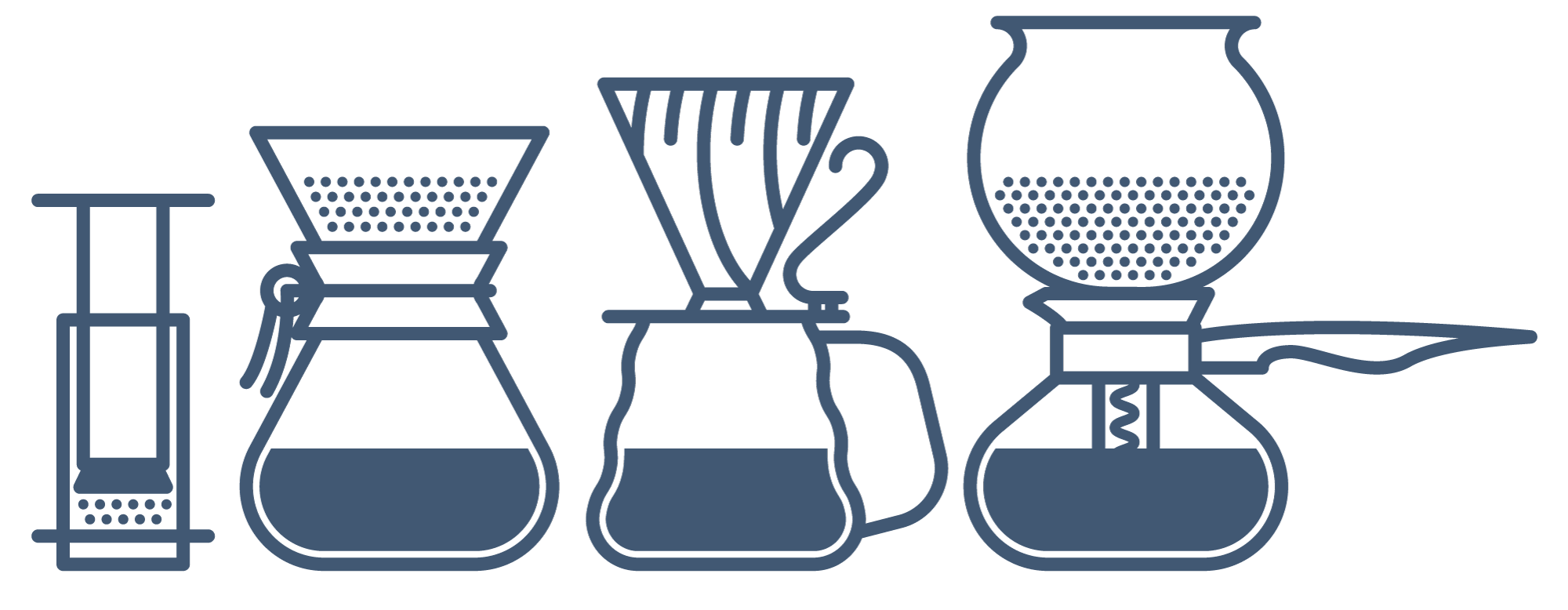
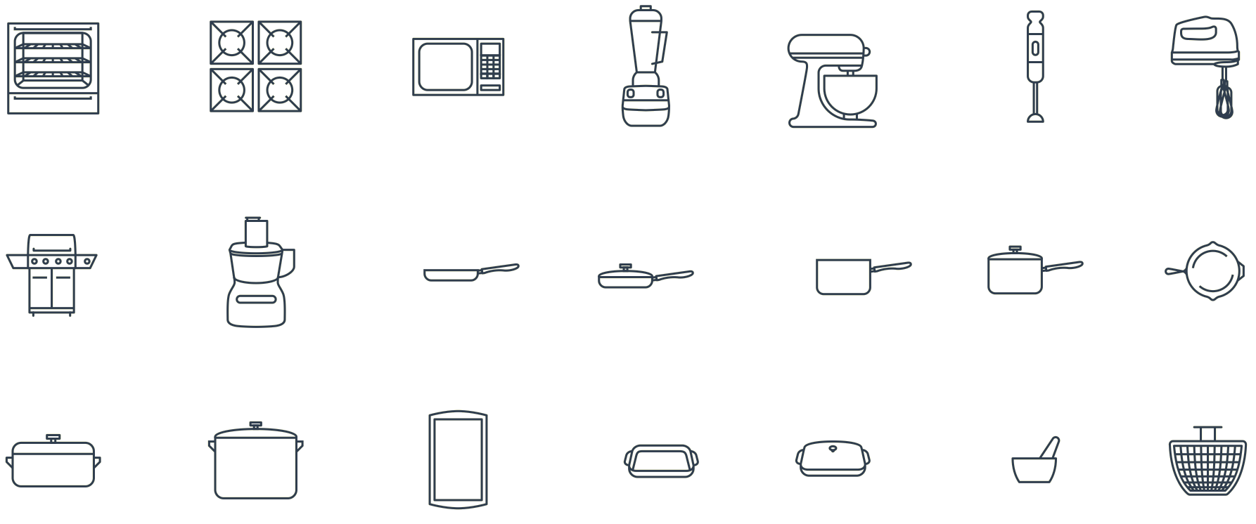
A family of icons drawn in a consistent style for use in Rooty Poots No-Compromise Coffee menu and in the custom recipe system.
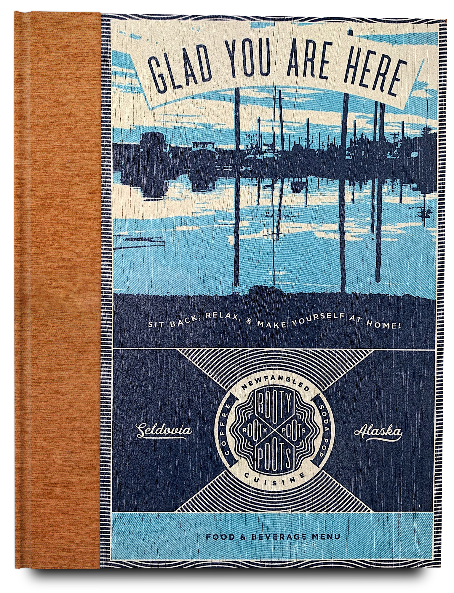
The Rooty Poots menu covers are printed directly on wood, hinged with copper door hinges, and their spines are bound with stain-resistant copper metallic bookbinding fabric.
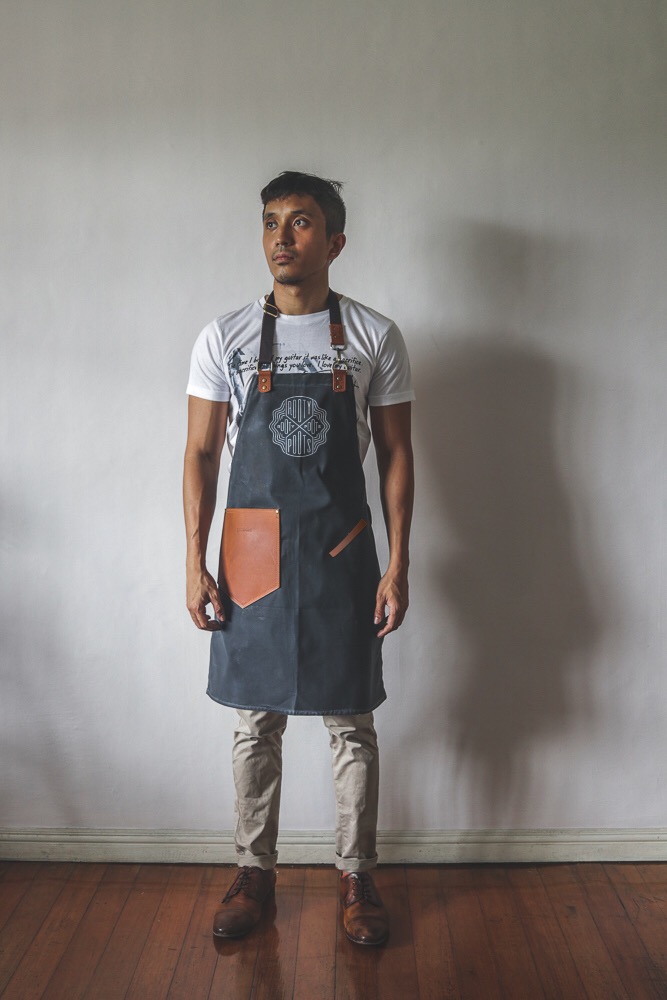
Custom waxed canvas and tanned leather aprons designed with Gouache, a Philippine maker of waxed canvas bags.
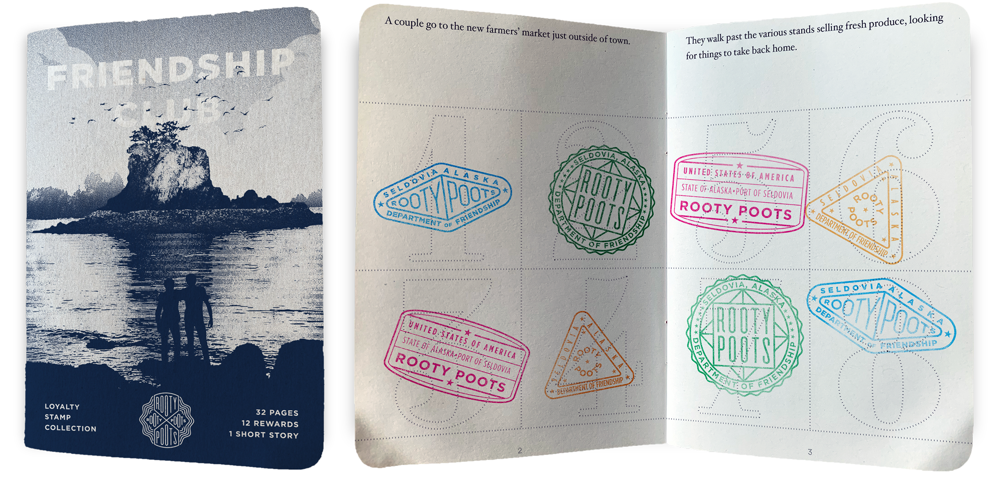
Instead of punchcards, we went with a Passport-style stamp book for Rooty Poots’ frequent customer rewards club. Every tenth stamp earns the customer a free drink, and a full book earns them a meal for two plus two free drinks. The book also tells a long and winding shaggy dog tale—a key element in the Rooty Poots brand voice.
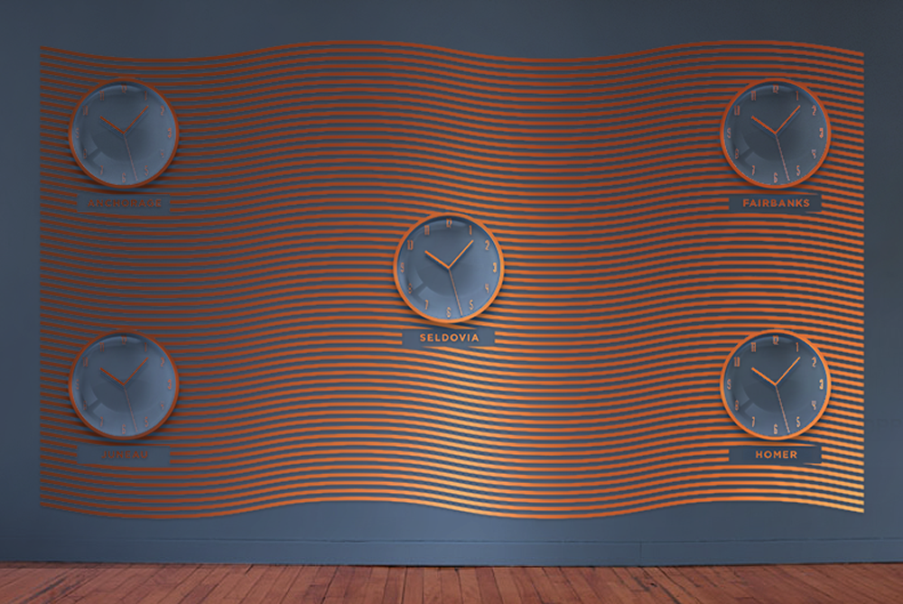
An accent wall with a bunch of clocks, each set to the time of a different Alaskan city.
The Rooty Poots logo, cut out of wood with a CNC router, mounted on the wall and painted white. An animated version of the logo gets projected onto it from a discretely-hidden ceiling-mounted projector that gets hooked up to the sound system and animates the logo to the beat of whatever music’s playing, whether it’s an Apple Music playlist, a record player, or a live band.
An animation of RUD-e—Rooty Poots’ robotic assistant—who answers the phone anytime a customer calls the Rooty Poots toll-free hotline. You can even press ‘3’ and talk to him, if you’d like! But be prepared to have eight minutes of your time taken from you as he struggles to hear you, gets bored, and starts telling you another long and rambling shaggy dog tale.
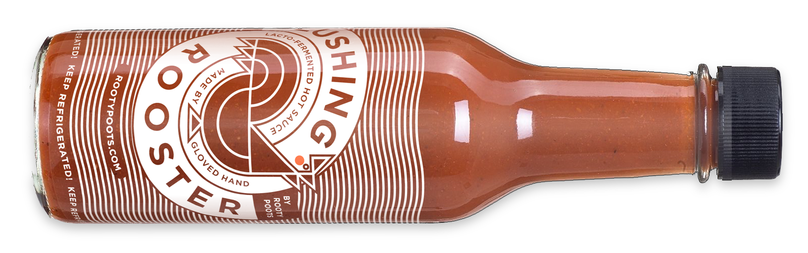
Rooty Poots’ brand colors are two shades of blue, a hit of copper, and a creamy off-white. And we adhere strictly to those colors! But what about situations where blue simply won’t look good, such as their housemade hot sauce? In the case of Blushing Rooster, we stuck with the creamy off-white as the sole color, and kept the rest of the packaging transparent, allowing the vivid color of the sauce itself to show through.
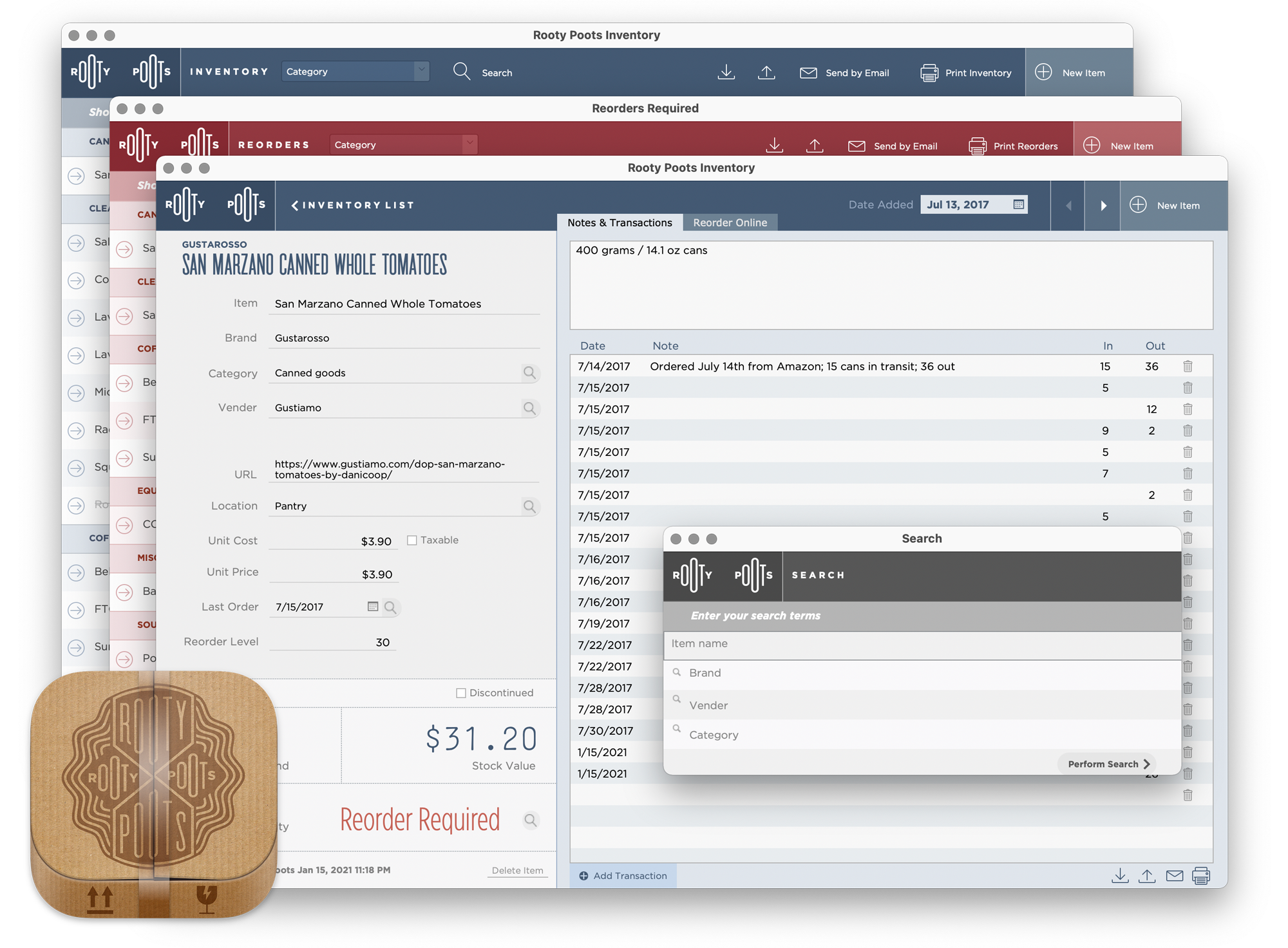
The variety of inventory applications out there is confusing. Nothing seemed just right. They were either complicated, full-featured accounting applications where 95% of the features wouldn’t be used, or they were combination inventory-POS apps more geared towards storefronts than a restaurant, whose needs are different, or they came close to being ideal, but charged a high monthly subscription price to use.
Rooty Poots Inventory is an app I made just for Rooty Poots, fully catered to the needs of a small restaurant that needs to track everything from ingredients to cleaning supplies, be notified when it’s time to reorder, and allows for reorders to be done from within the app itself. There’s also an accompanying iPhone Shortcut that scans product QR codes on the shelves, allowing employees to quickly and easily update the inventory over the network.